SIRAB
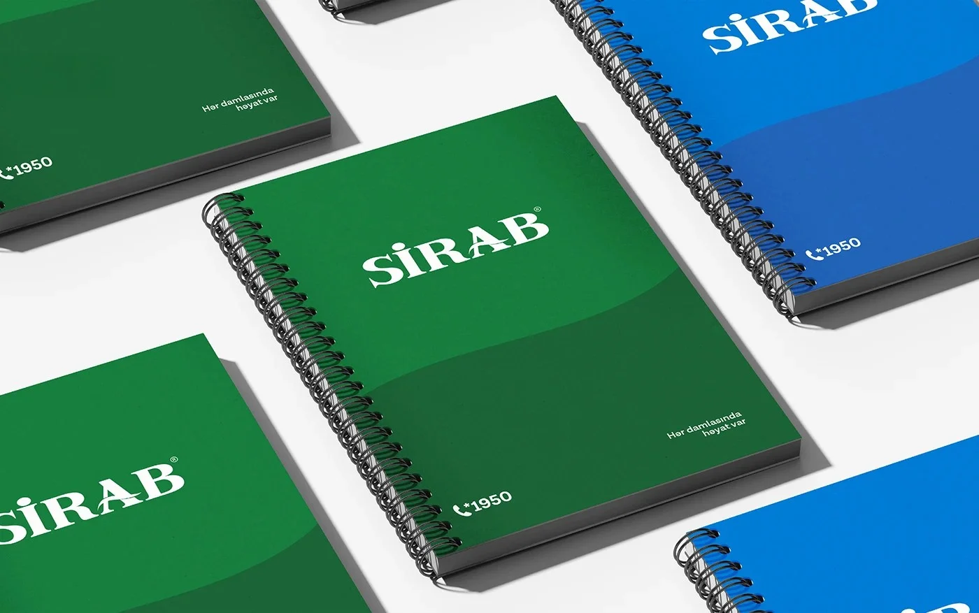
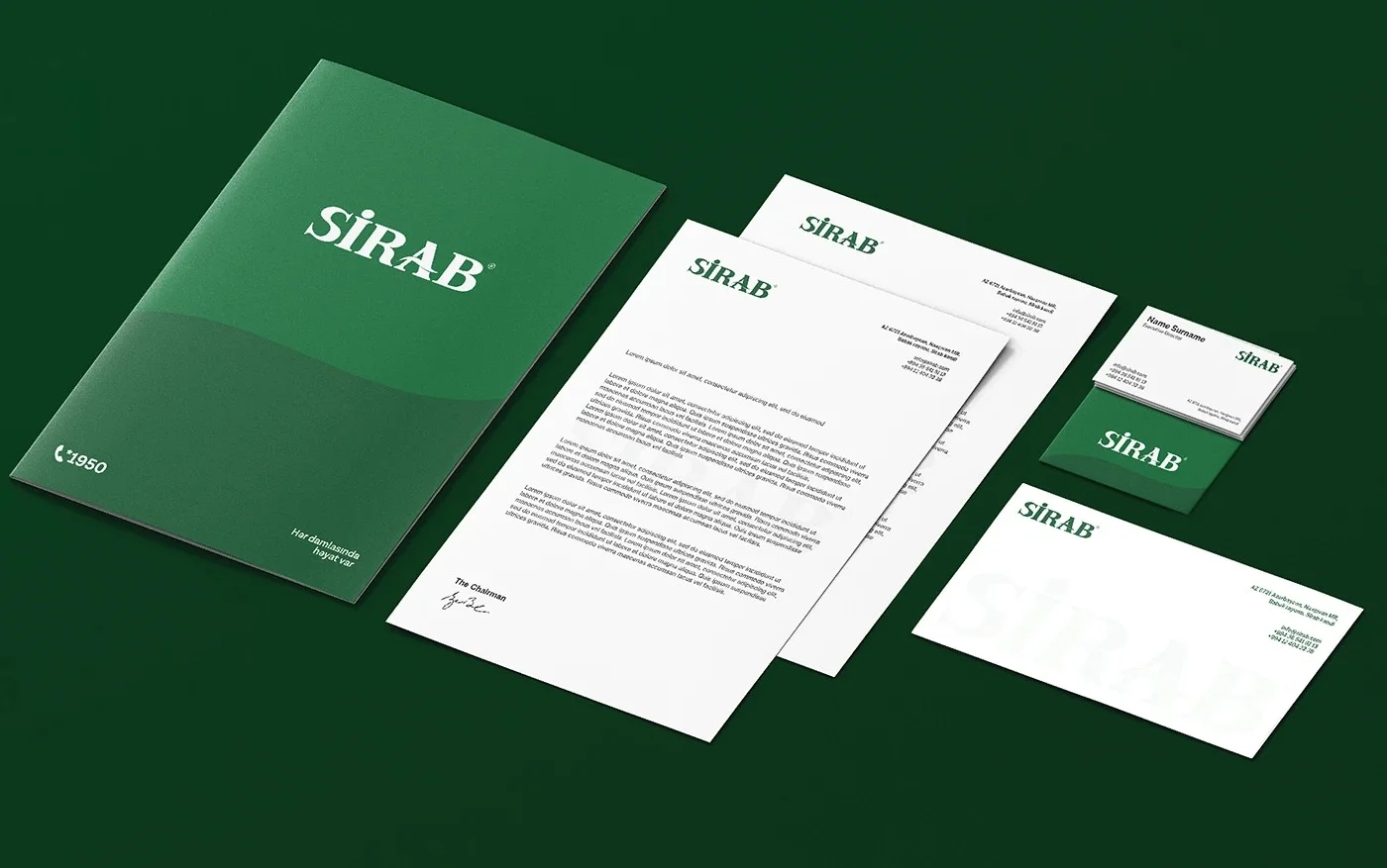
We have renewed "Sirab" in a more modern and minimal style while staying true to its core values.
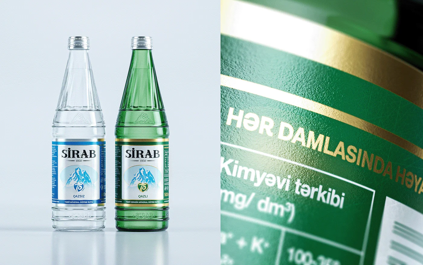
The new logo has been designed with a focus on minimalism. For the overall label, we introduced subtle yet impactful refinements. By preserving classic elements and incorporating modern design details, we created a look that honors tradition while embracing innovation.
The result is a more modern and refined "Sirab", with a design that remains faithful to its heritage.
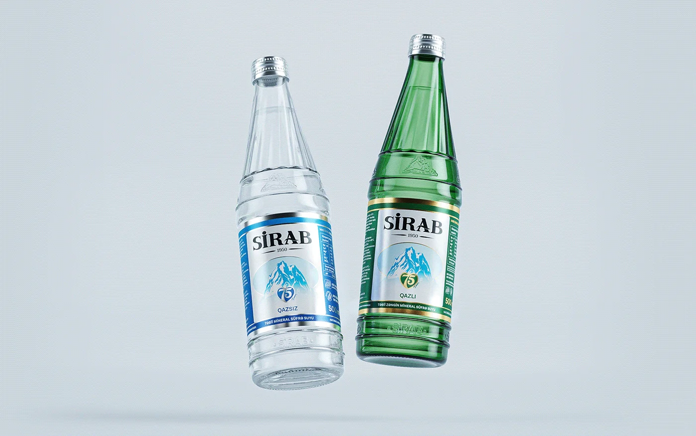
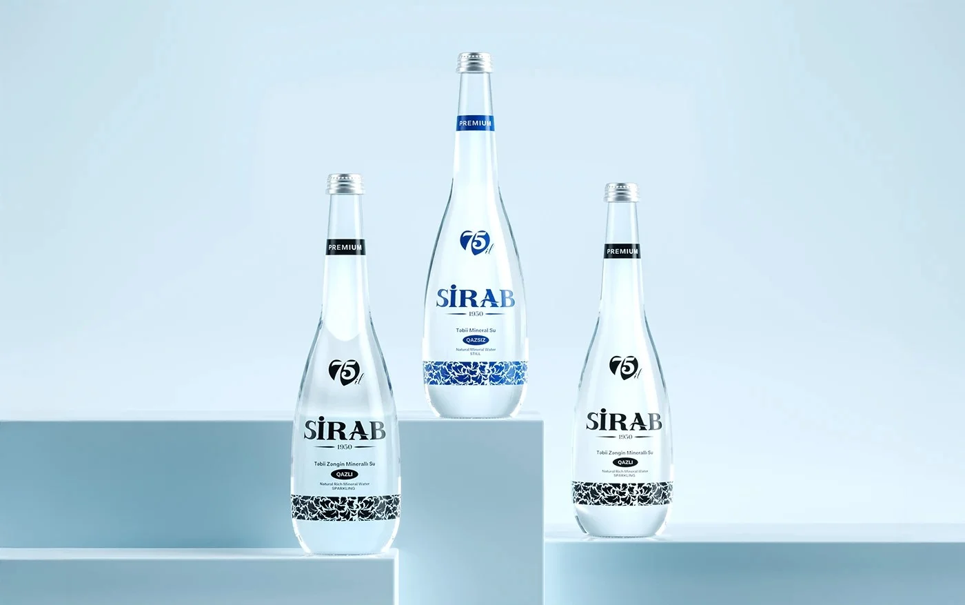
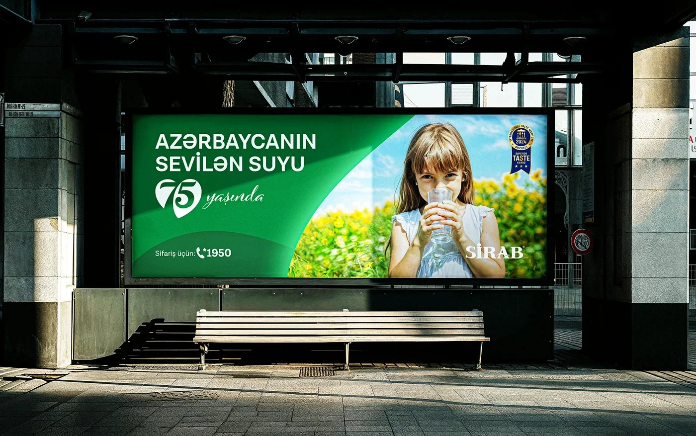
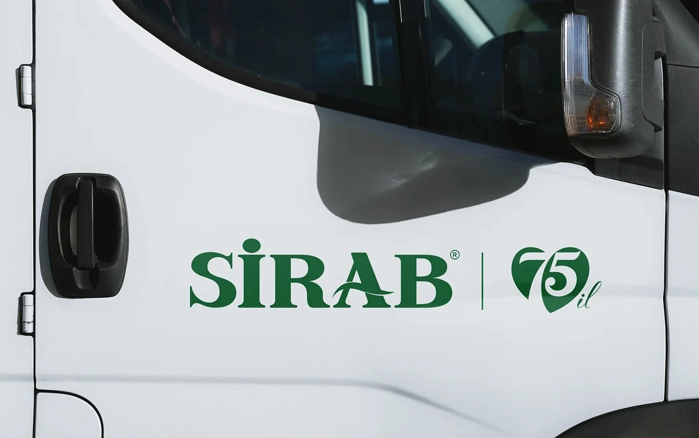
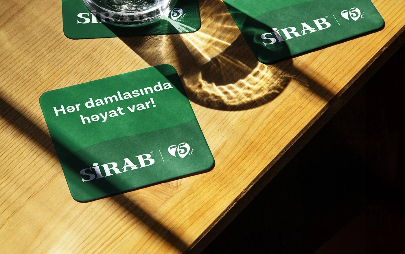
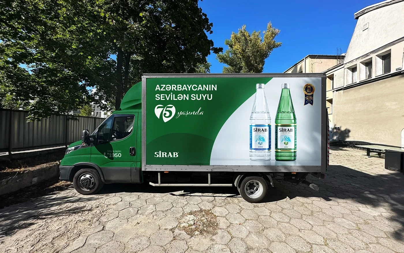
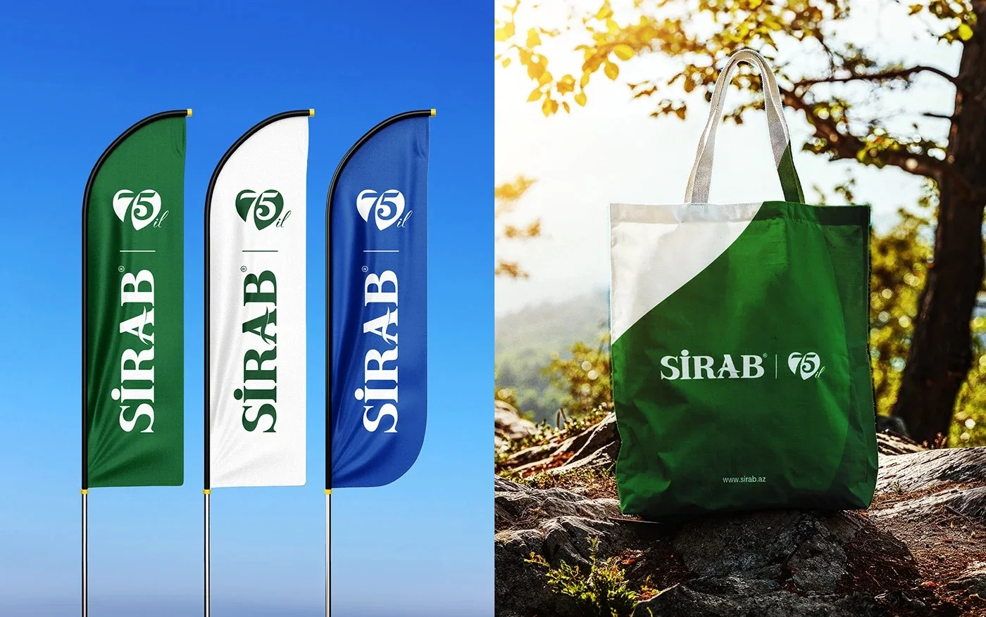
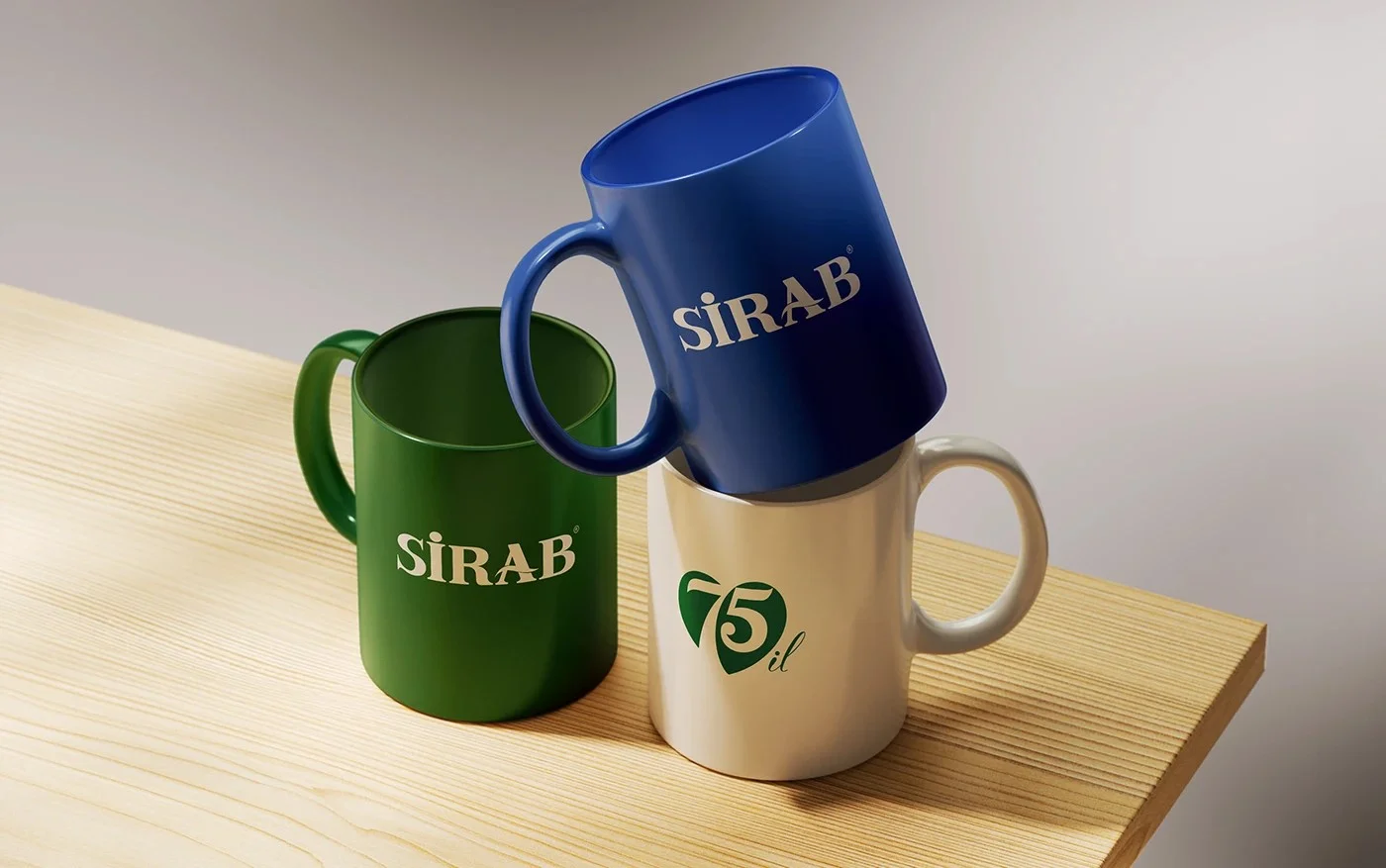
For 75 years, "Sirab" has been cherished for its pure and natural taste. To celebrate this significant milestone, we have introduced a special anniversary logo.
The new "75th-anniversary logo" combines the symbols of a "heart and a water droplet". The numbers "7 and 5" come together to form a heart shape, visually representing the message "Azerbaijan’s beloved water." This design is a symbol of "Sirab’s purity and the love it has earned over the years".